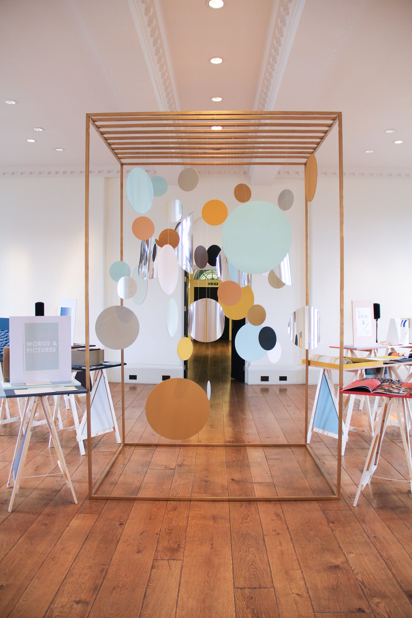
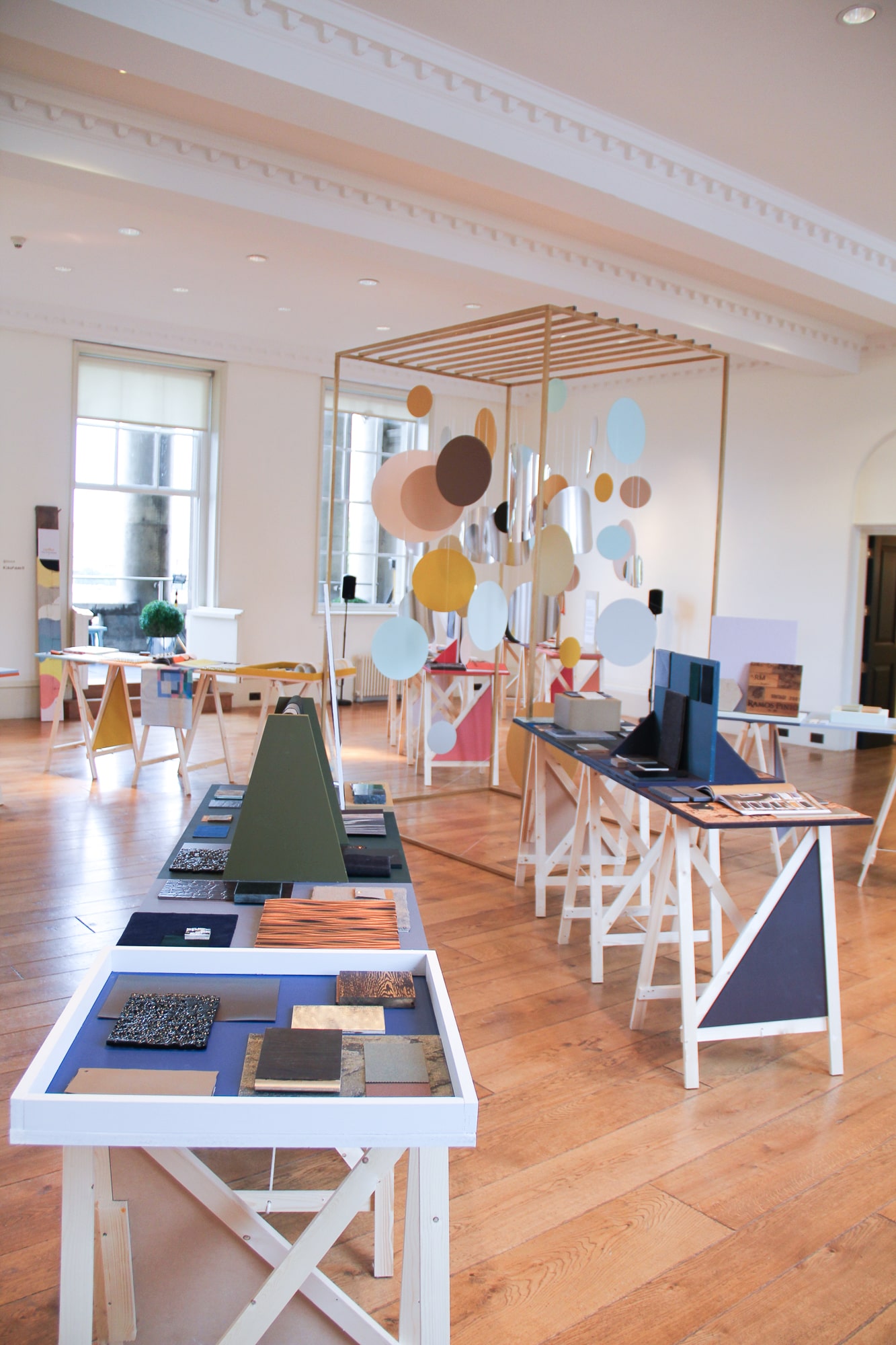
Looking Both Ways

exhibition design and material curation for dulux

Colour Futures is the annual colour trend forecast created by paint manufacturer Dulux. It represents the culmination of in-depth research and debate carried out by leading industry professionals concerned with lifestyle and design trends from around the world. Each year, as part of the global launch a special event takes place in London to help explain the research and illuminate the colour trend formulations.


Colour Futures 16 explored themes of duality, with the crossroads of tradition and modern technologies providing the catalyst for the mantra “looking both ways.” The launch event took place at London’s prestigious Somerset House and was spread across a number of days with architects, interior designers and the associated press invited to discover the story behind the forecast, the colours selected and a special material exhibition. The aim of the latter was to bring the trends to life by applying their rhetoric to a wide selection of materials that might actually be used in an interior design scheme, thus adding further depth to the trends. As well as creating the exhibition displays and curating the materials for each trend I was also commissioned to create a large-scale central installation that celebrated the Colour of the Year palette.


Green-Banner.png
 
 
margate-material-consultant.jpg
 
Cascade-min.jpg
 
Green-Banner.png
 
Cherished Gold central installation

Cherished Gold central installation


“Curved mirrored circles were suspended amongst circles of colours taken from the Colour of the Year palette, creating reflections and snippets of colour in all directions.”

 
surface-design-east london.jpg
 
Curated material displays

Curated material displays

 
Looking Both Ways

Looking Both Ways